Kepler
Si certus es dubita
vexillology
Today I learned. Thank you!
vexillology
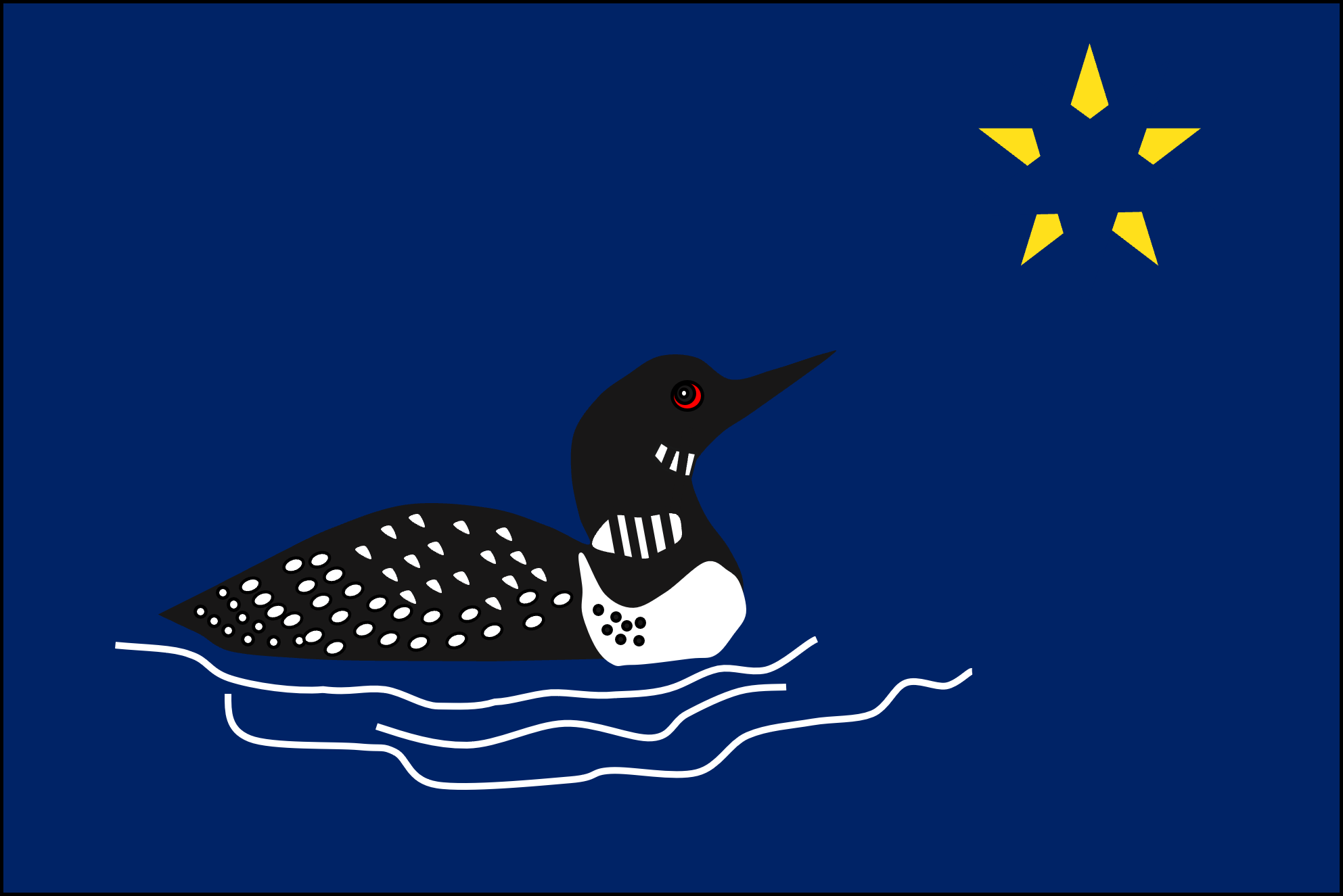
California, Maryland, South Carolina, the new Utah, new MS, Alaska, New Mexico are all ****ing great flags. Desperately personal to the state, clean, not corporate garbage.

I have to look at Maryland all the time. It is hideous. It should be the seal, not the flag.
New UT was close to genius but the background sucks.
Arguments can be made either way on Utah's background.
But the Minnesota flags could be flown over any state capitol. Great flags would look out of place anywhere but where they're flown.
worth noting that one of the finalists for MN state flag is basically identical to the city flag of Duluth.

Today I learned. Thank you!
Were any of the MN entries non-ironically any good? I saw the Uff da one.
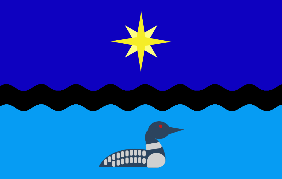
This is obviously what should be flown:
Desperately ignore the /r/vexillology nerds. They're wrong. Borne out of bad modern spartan design coupled with silly old traditions.
One thing that all those have in common is that all you need is a quick look to identify what it's representing.California, Maryland, South Carolina, the new Utah, new MS, Alaska, New Mexico are all ****ing great flags. Desperately personal to the state, clean, not corporate garbage.
One thing that all those have in common is that all you need is a quick look to identify what it's representing.

too busy for what? Betsy Ross to sew it? These stupid antiquated vexillology rules are so lame.
Honestly, of the finalists, the dual loons (cloud / water) are the best, but the star needs some work. It's not unique enough IMO. Maybe if it had the Dakota Star or the Polaris / eight pointed star instead...