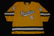
Re: Sweet Release: Michigan Tech Offseason Thread Part I
Not sure if this was found by anyone in the past but I just came across it and found it pretty interesting.
http://boards.sportslogos.net/index.php?showtopic=69859
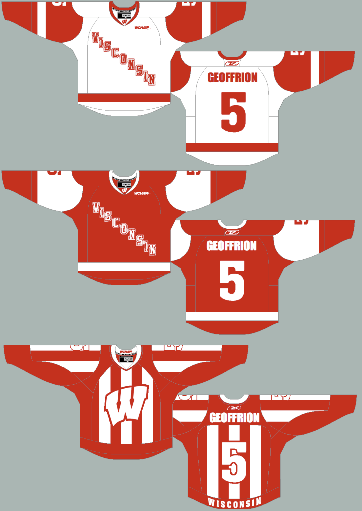
I like our current jerseys much better than what he came up with for Tech.
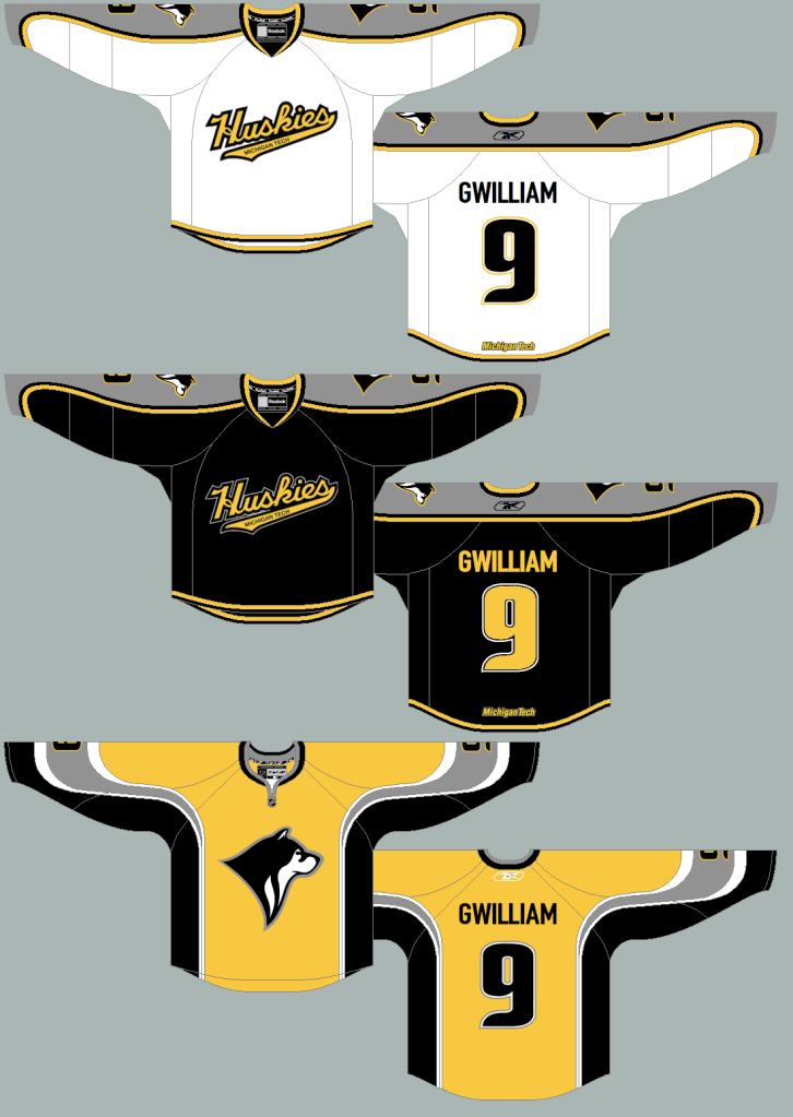
However, check these bad boys out. We need the alternate in Tech Gold stripes. If not for the team, for the pep band.
Not sure if this was found by anyone in the past but I just came across it and found it pretty interesting.
http://boards.sportslogos.net/index.php?showtopic=69859
I like our current jerseys much better than what he came up with for Tech.
However, check these bad boys out. We need the alternate in Tech Gold stripes. If not for the team, for the pep band.
Last edited:


")