unofan
Well-known member
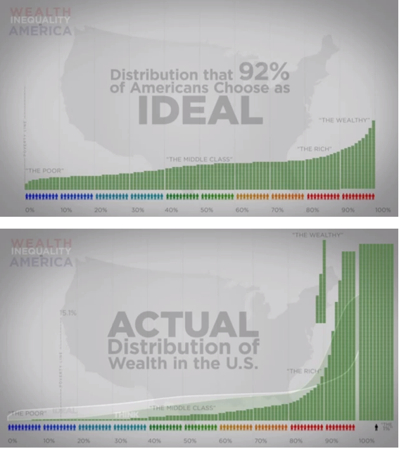
There are lots of surveys where the Man on the Street is quizzed about how much the top 1%
- owns (they answer 10%)
- should own (they answer 5%)
Then they lay the real number on them: 32% and their eyes do cartwheels.
People have no idea how iniquitous our system is.
This is from 2011, so the actual inequality is worse. There's also a 3rd graph somewhere which shows people's estimated actual distribution, and it's still way off.